🤳 Connecting Solo Museum Visitors
- 9 minsEnd-to-end design project: Connecting museum visitors
Nature: Full cycle research: design, testing, iteration, and final prototype
Type: Team project with 4 members Juspreet, James, Carol, and myself (from psychology, industrial design, and computer science backgrounds)
Methodologies: Survey, interview, qualitative data analysis, sketching, wireframing, lo-fi prototyping, usability test
Duration: 4 months
My role: User Researcher, ideation and prototyper
Table of Contents
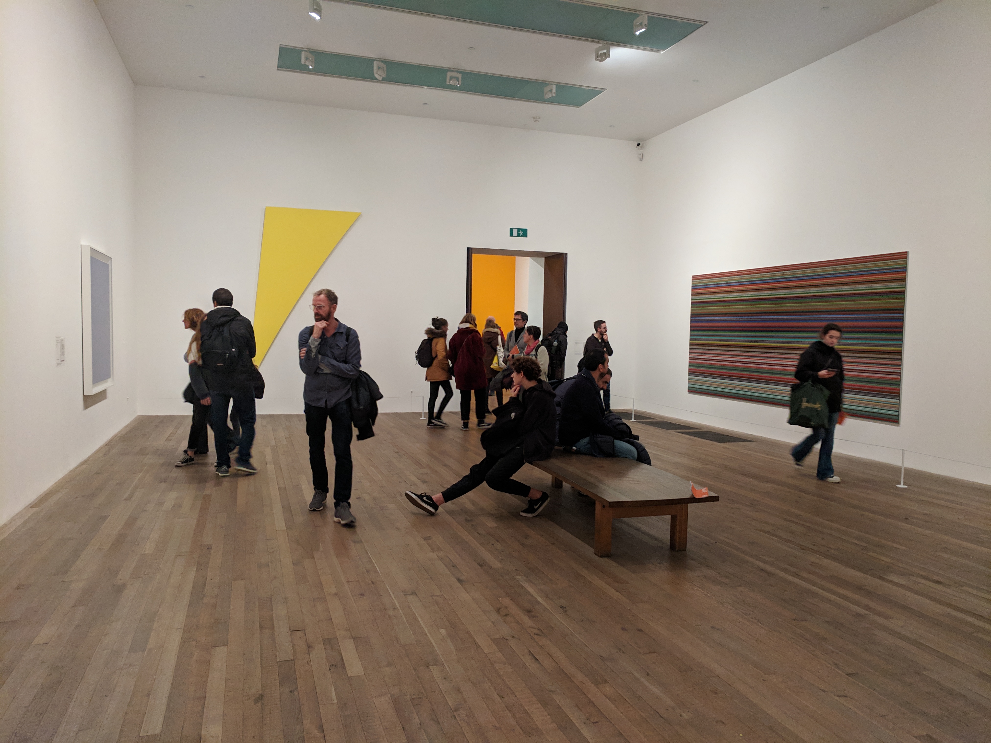
In recent years, art museums have become increasingly popular, with the largest exhibitions worldwide seeing up to 10,000 visitors each day (Pes & Sharpe, 2012). Social interaction has a crucial influence on visitors’ perception of artwork, as well as the museum experience as a whole (Tröndle et al., 2012). Social interaction may allow the transference of knowledge due to the possibility of discussing the meaning behind artwork (Sintas, Álvarez, & Rubiales, 2013).
Despite the importance of social interaction within the museum setting, many visitors may not have opportunities to discuss their thoughts with others, particularly when visiting alone.
This project aimed to design a solution allowing museum visitors to interact with other people of their choosing in a way that would be comfortable for them.
1 User Research and Establishing Requirements
1.1 Questionnaire
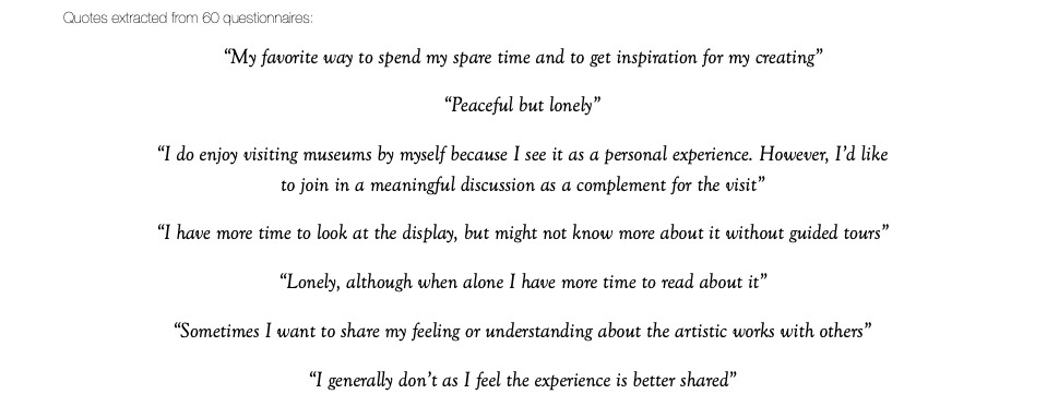
60 responses from questionnaire
To begin to develop an understanding of our users’ needs, we constructed a questionnaire consisting of both open and closed questions. The questions explored general themes relating to visiting frequencies and durations, motivations for visiting, and issues surrounding comfortable interaction with others. We recruited people online and in-person outside of art museums in London, resulting in a total of 60 responses.
1.2 Interview and observation
10 semi-structured interviews
We conducted semi-structured interviews with 5 visitors and 5 members of staff at Tate Modern. The themes of the visitor interview focused more specifically on interaction preferences, whilst the staff interview was adapted to include their observations of visitor-visitor/visitor-staff interaction and their knowledge of how interaction was encouraged by the museum.
Visitors were conscious of moving on quickly so that other visitors could have the chance to read the label. The interactive displays we observed seemed to discourage collaboration as they used individual booths or screens where it was difficult for more than one person to use the system at any one time.
1.3 Analysing research data
I used thematic analysis for our interview data, then developed affinity diagram with my teammates to organise data into categories.
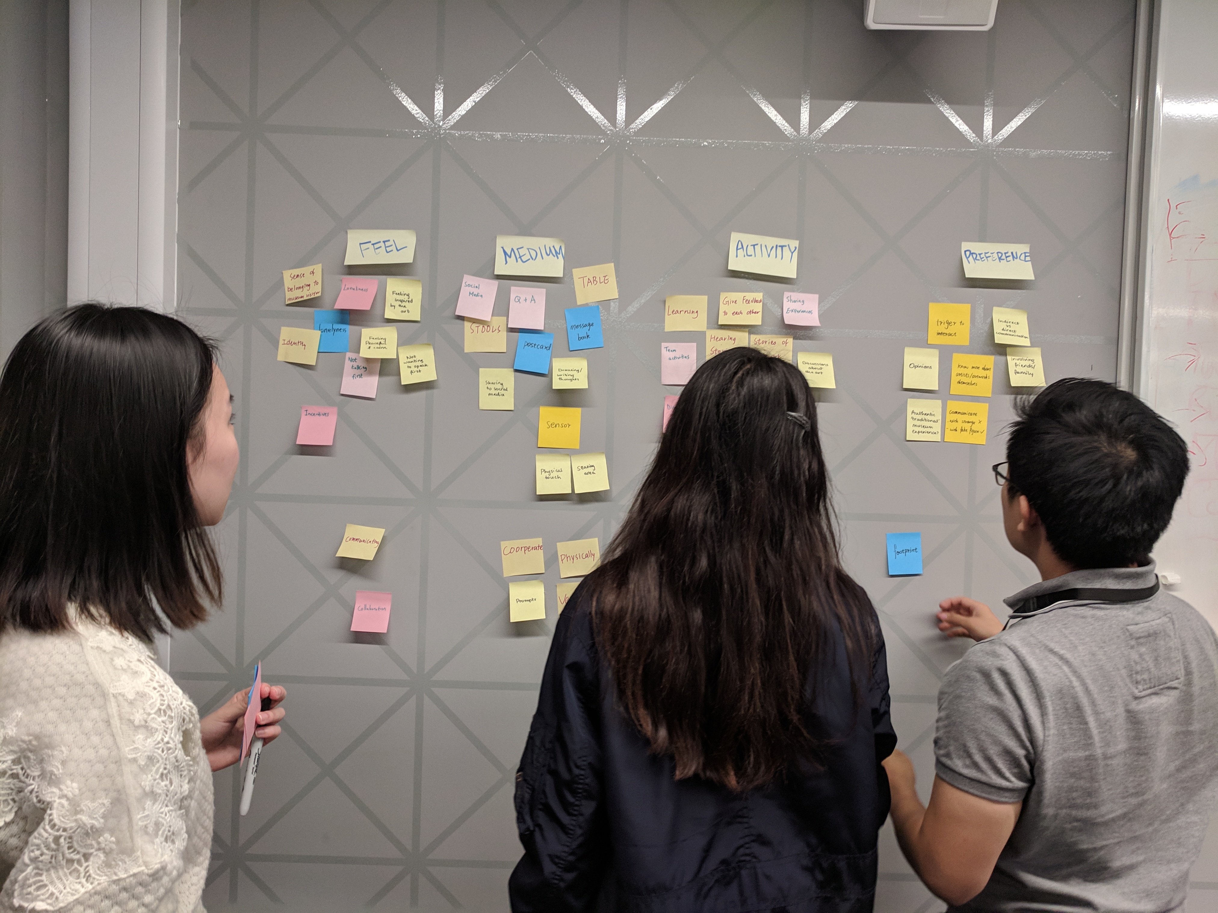
Some of the key ideas that emerged were:
- People feel relaxed, peaceful, reflective, and free when they visit museums alone but also feel lonely and/or curious about the artwork.
- In order to feel more comfortable interacting with others, people do not want to be the one to initiate a verbal conversation and would prefer indirect facilities rather than direct conversation.
- People would like to talk to people with similar interests as them and the opportunity to talk to staff and artists.
- Some people did not want to talk to others and had concerns about speaking loudly in the museum setting.
- Discussions should revolve around the artwork and people’s opinions.
- Experiences are currently shared through discussions, social media, and pictures.
- One of the key findings emerging from interviewing members of staff was that often even when exhibitions required collaboration from visitors, this rarely encouraged direct conversation about the artwork itself to occur naturally.
Gathering insights from previous research and our data collection, we aimed to design an experience that promotes deeper understanding of the artwork or artist, acts as a prompt for visitors of all levels to share their opinions, and to extend the topics around the exhibition outside of the museum.
2 Design Process
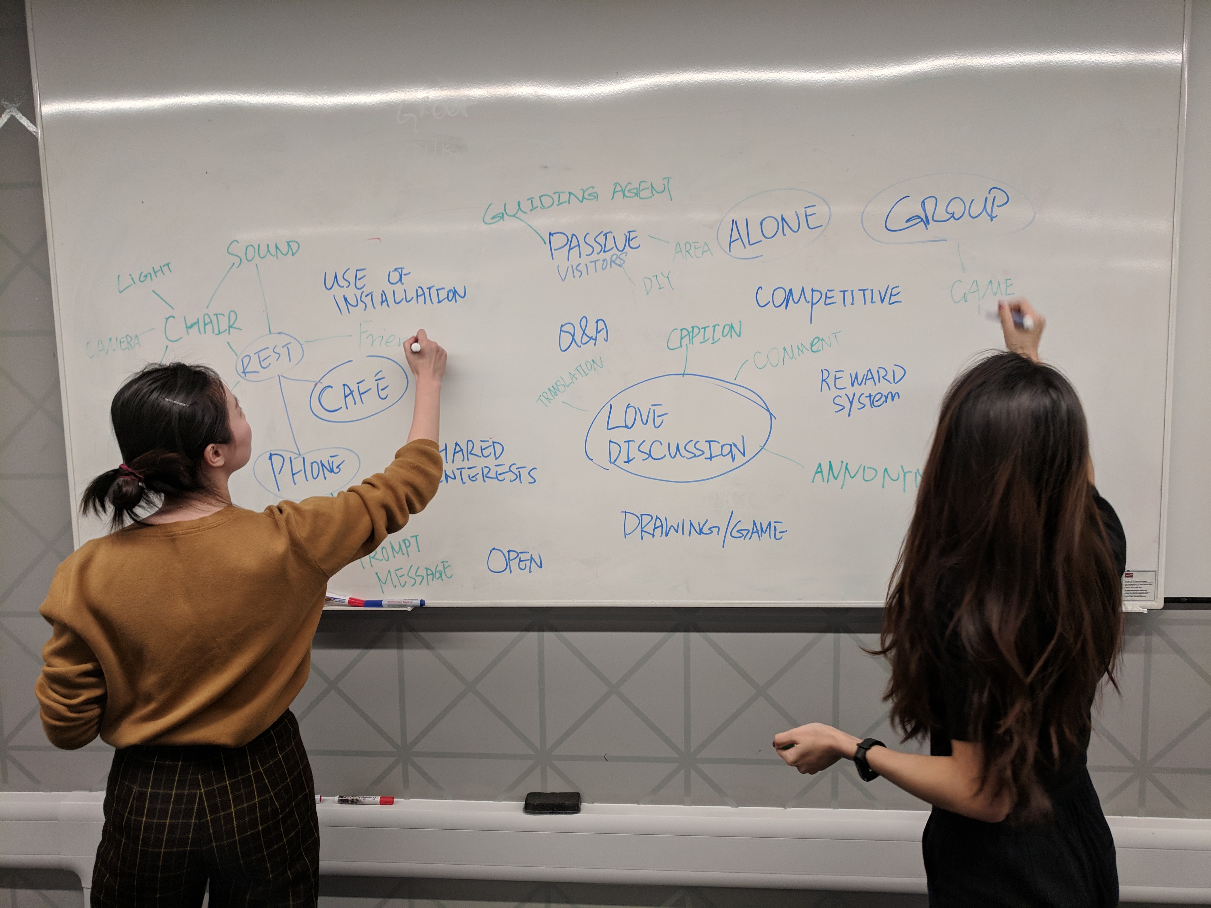
We started to sketch our own ideas with individual brainstormings. Then we discussed our ideas in terms of how close it addresses the user pain points.
2.1 Ideation: Crazy-eight brainstorming
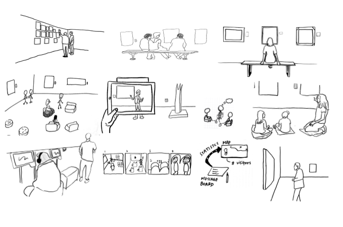
I came up with concepts that were of general and coarse granularity. For example, we wanted to provoke conversation at museum seating area using conductive paint, to interact with artwork through bodily collaboration, or to activate artwork display by two different handprints.
2.2 Refining ideas
As a group, we eliminated ideas that were ineffective at easing user pain points, costly to the museum and those solutions that already exist yet not welcomed by visitors. I then evaluated our remaining ideas based on our selection criteria: novelty and feasibility.
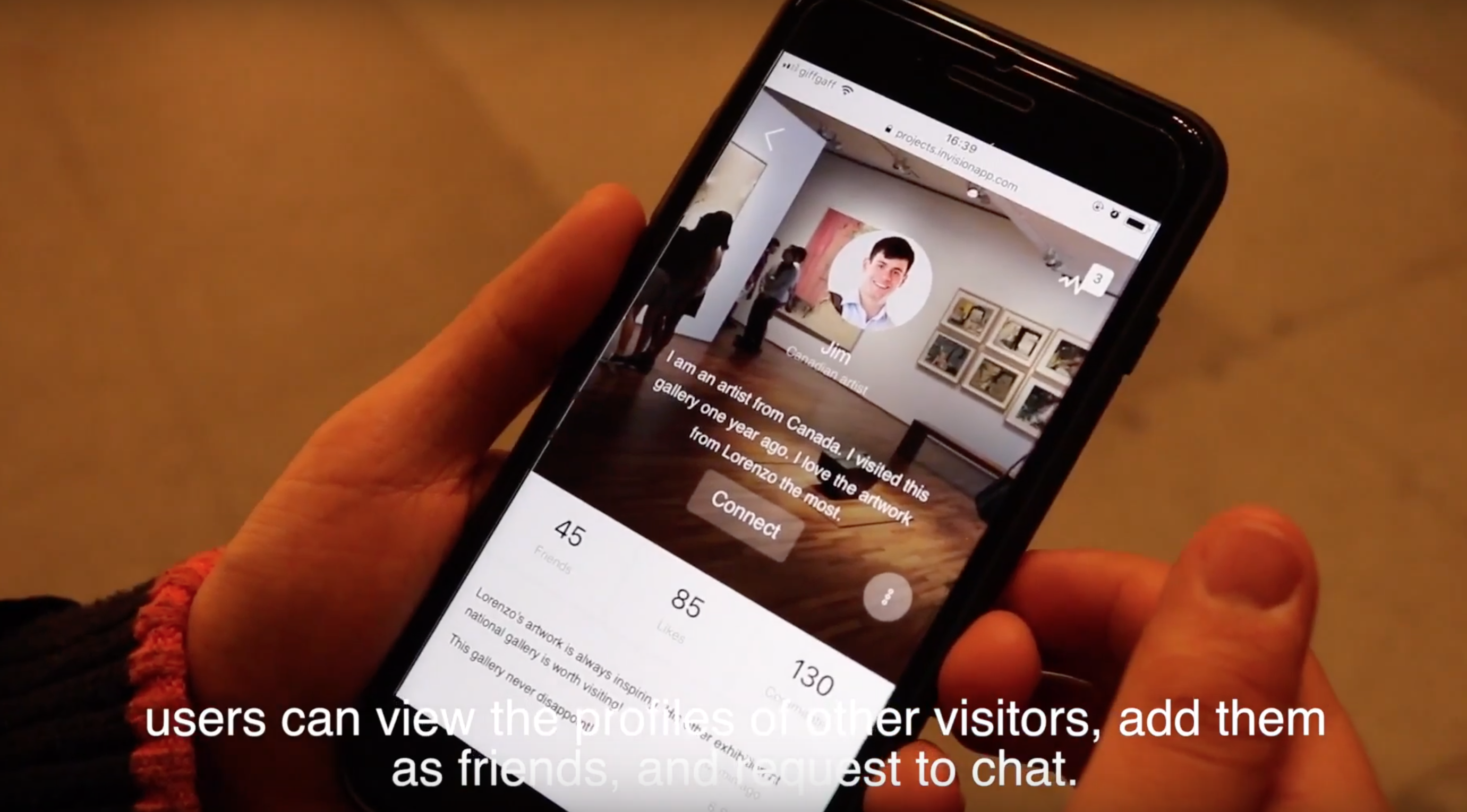
We moved forward the idea of web app and digital wall display eventually. This is because it can deepen visitor knowledge in art by providing extra information and fun facts about the artwork background, it can also promote interaction within the visitor circle through the commenting and following other visitors.
2.3 Parallel Prototyping
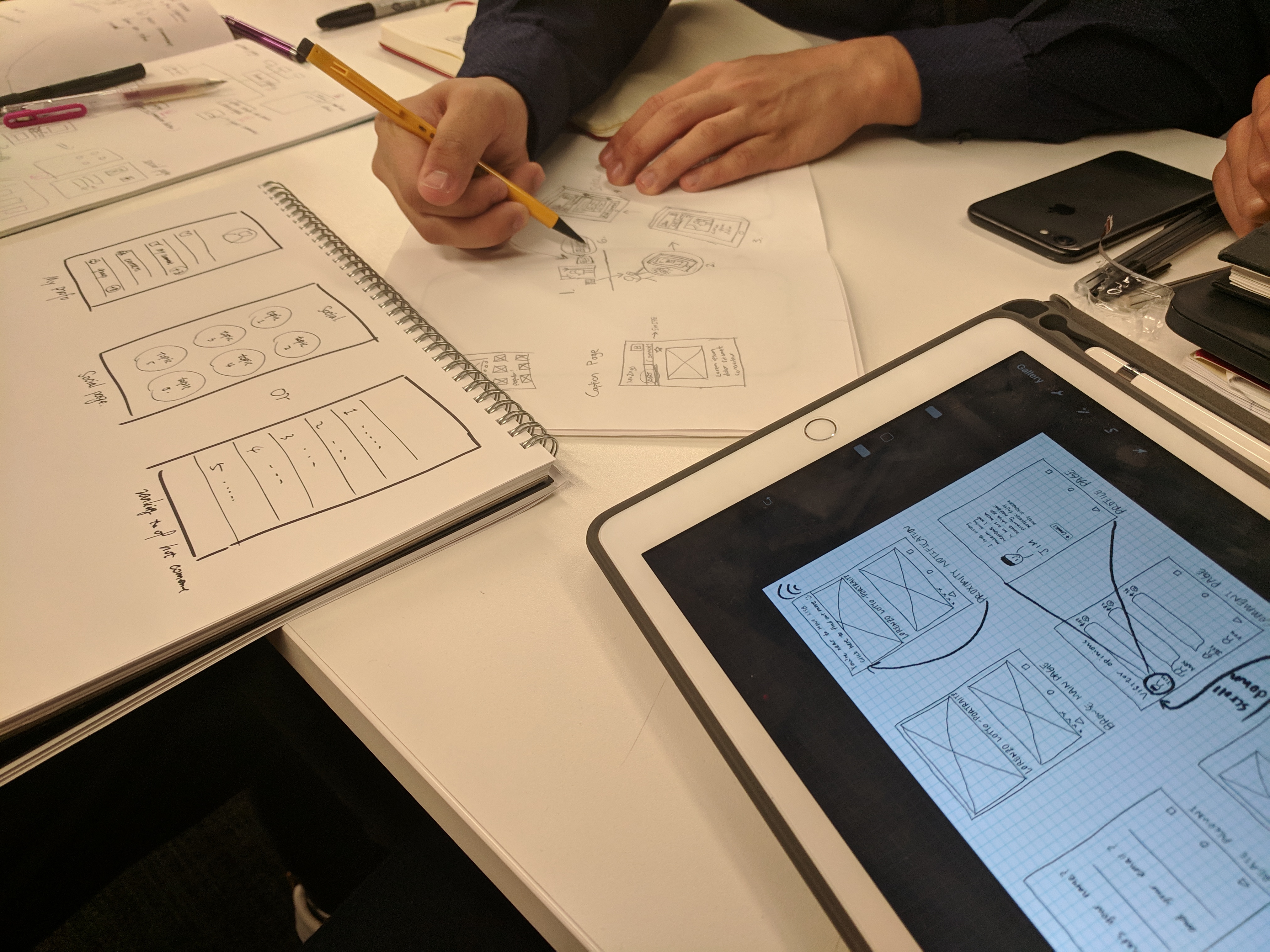
We decided our initial workflow by listing the tasks that a visitor would do when he/she interact with our intervention. After that, we each came up with five sketches of the web application, totaling 20 sketches.
Wireframes and prototyping
User journey storyboarding
To align our team’s design goal, I created a storyboard listing the key moments of interaction and ensure everyone agree the same experience we were going to design.
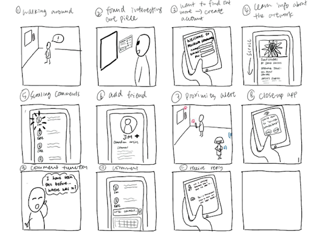
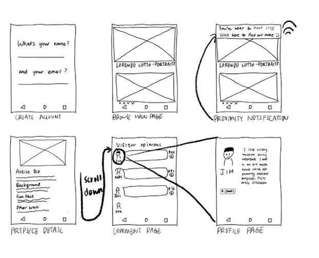
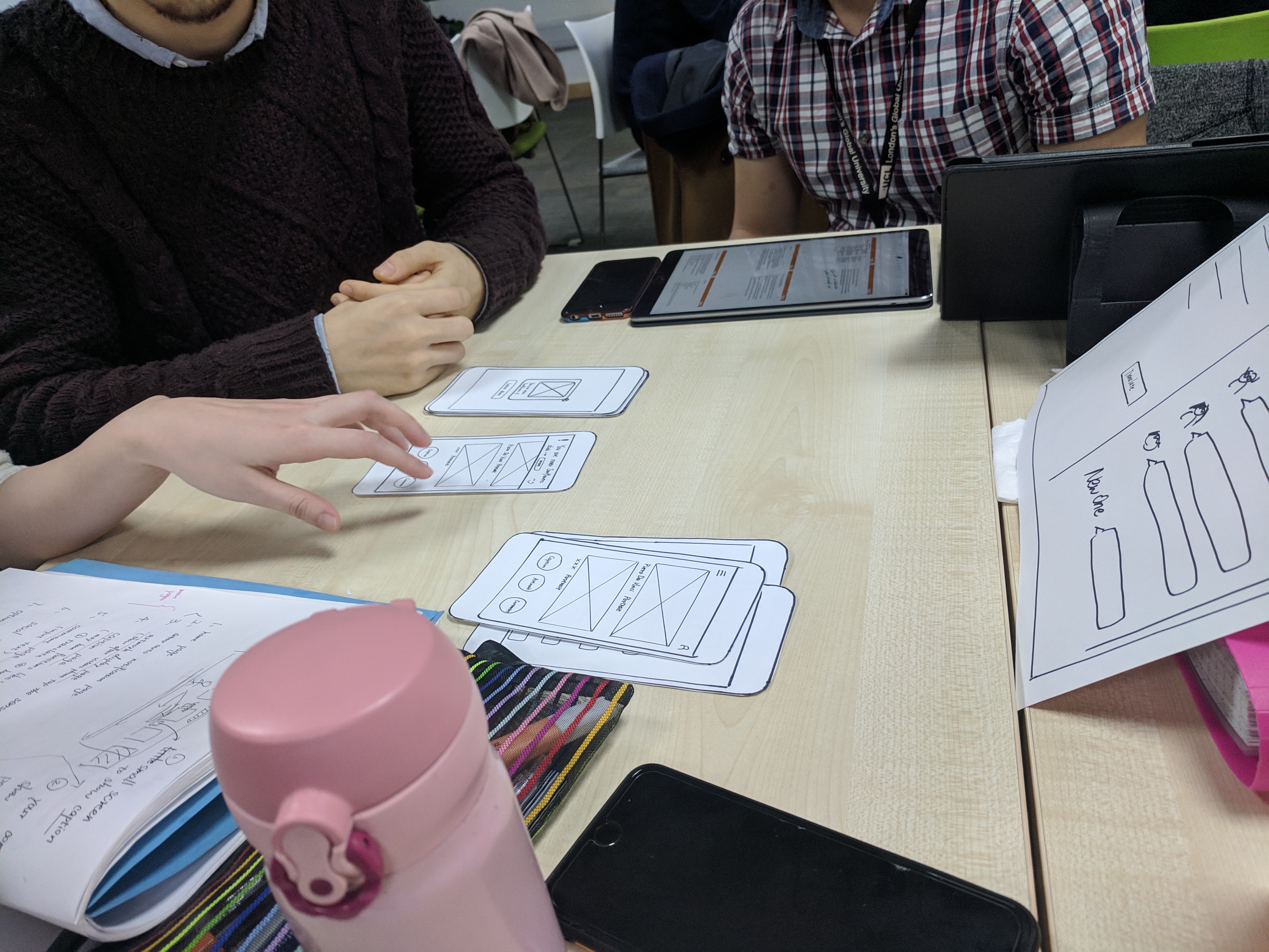
We then moved on to discuss the pros and cons of each design and put forward a complete user flow with different versions of the interface for further testing. We created paper prototype of a mobile phone app from our initial sketches.We also created a paper wall display for later testing.
Internal evaluation of prototype
Each of our team members took turn to explain the mentla models behind our designs. We discussed and critiqued each other’s work. Eventually came up with minimum viable prototypes (MVP) for further testing.
3 Usability Testing
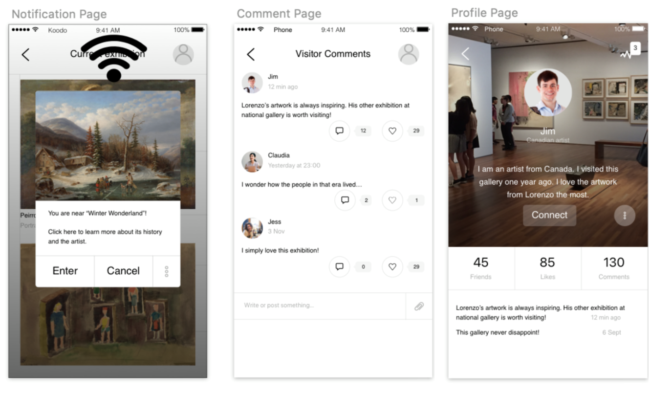
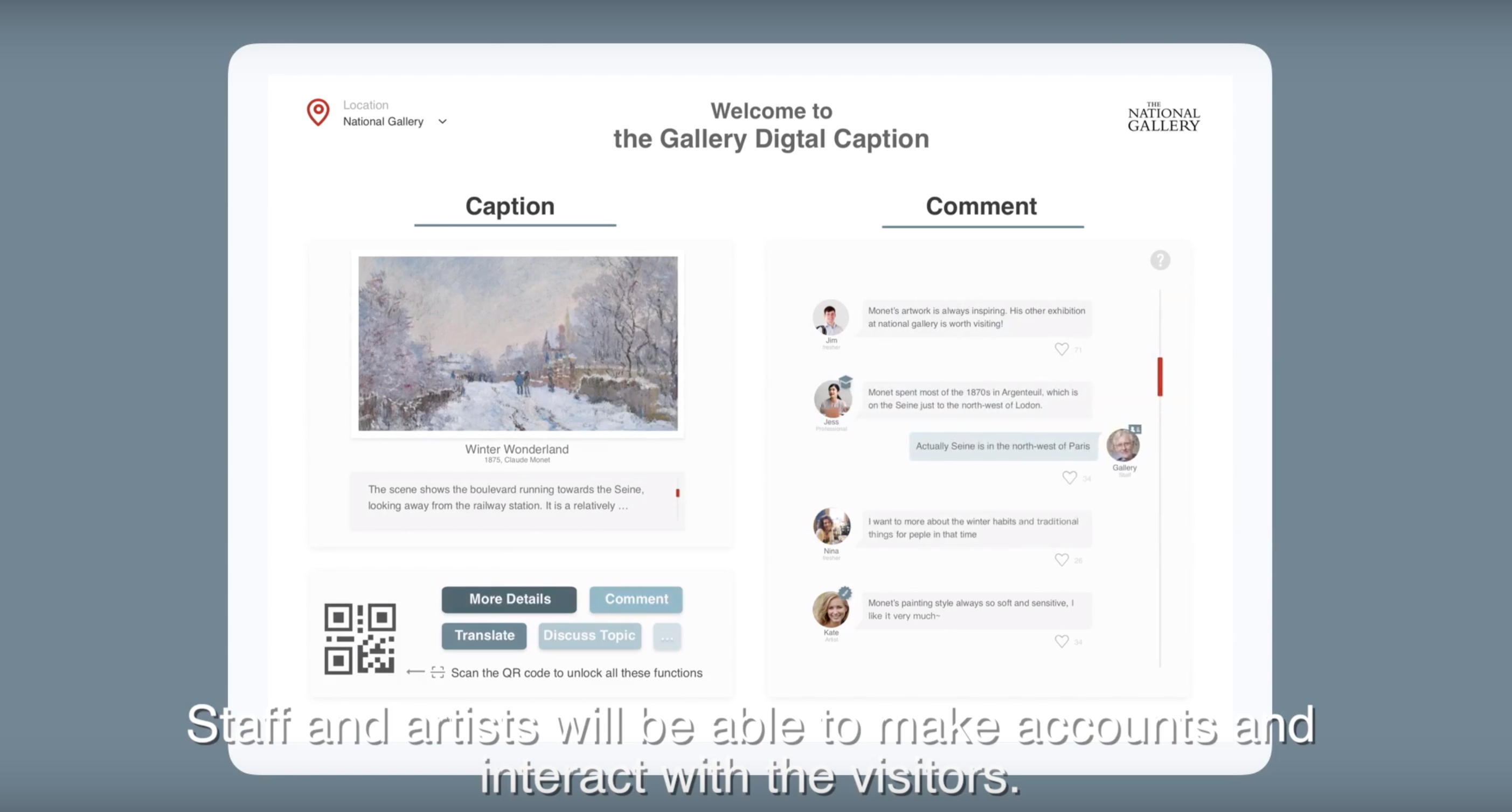
I co-led usability tests with our user group using paper prototype. This informed us that people could easily understand that they are required to open the web app by the QR code in order to learn more facts about the art (plus other features). I found that during the proximity notification, the participants preferred a whole-screen message box over a non-intrusive banner. They generally welcomed the interruption on the web app because they would like to be immersed in the visiting experience by having extra exhibit information prompted conspicuously on their phones.
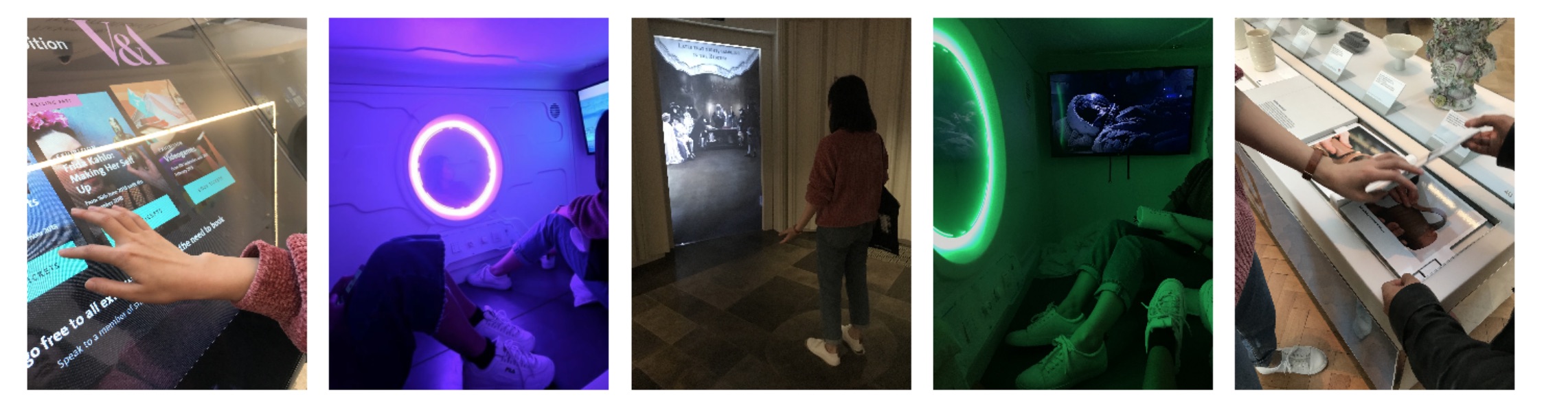
The response for choosing between continuous scrolling and tab node was mixed. Some prefer scrolling as less attention required to navigate around the app, while other prefer tab mode could give an overview of the artwork and comment tabs at the beginning. Regarding the participants’ feeling towards the intervention, they were positive to learn more fun fact about the art piece. A participant pointed out that reading other visitors comments on the wall display was a fun thing to do, as she usually read the comments in other media as well. The following images represent part of the design process.
Back to Top
4 Final design
The constructive and positive feedback from our participants were encouraging. For the mobile web app, we decided to adopt a main page that could be scrolled continuously instead of having the art piece information and comments put in separate tabs. This is to enhance user experience in the physical space by minimising cognitive workload to navigate between tabs during the exhibition.
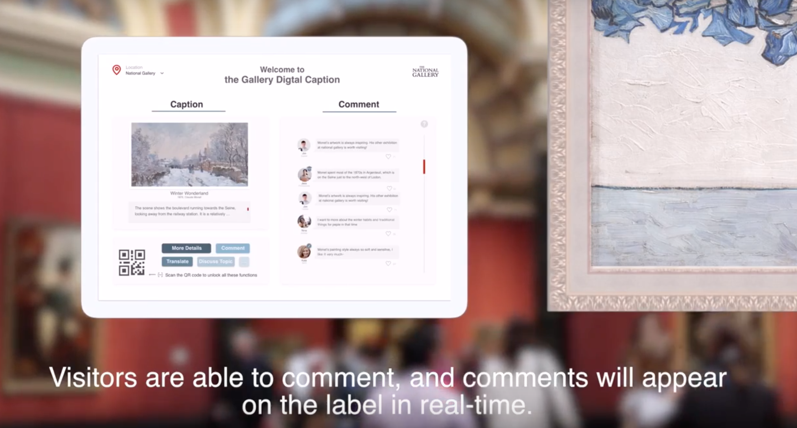
We incorporated the feedback on full-screen message notification into our final design. A final prototype was created that allow user to interact on any mobile browsers.
Thanks for reading!
Back to Top