💊 Patient Data Dashboard at the ICU
- 7 minsRealtime Patient Data Dashboard at the ICU
Nature: Qualitative Research
Type: Team project with 6 members from psychology, computer science and UI design backgrounds
Methodologies: Field visit, semi-structured interview, thematic analysis, observation
Duration: 4 months
My role: User Researcher
Background
In this project, I worked on evaluating and improving a patient data dashboard prototype. The dashboard was intended to provide real-time ward data, so as to inform timely decision making, thereby better patient care at the Intensive Care Unit (ICU).
This project was in collaboration with the Health Informatics Team at UCLH. When I started my work with them, the team already have an interactive physical dashboard prototype with fictional data for user testing. I worked as a user researcher to conduct the field work to understand how well the existing prototype address the user need.
Research approach
I used semi-structured interview accompanied with observation during an ICU visit. I interviewed junior doctor, one of the user groups in this study. The data was transcribed and analysed thematically
Semi-structured interview is a common qualitative research approach in health services when we want to understand subjective perspectives. Interviewing users allows me to understand the user workflow and mental models flexibly. Following an interview protocol prepared earlier, I asked the doctor questions under different points of interests, but also follow-up questions on the new ideas raised by the interviewee. Being able to ask follow-up questions right away was also a benefit of semi-structured interview as it allows the flexibility to dig deep on insights.
The fact that we were conducting the interview at an open corridor at the ICU, though initially a constraint due to the doctor’s tight schedule, as well encouraged interaction with the staff who passed by. This not only made the interview process more relaxing, but also sparked discussion surrounding the use of dashboard and general opinions among other staff members.
As the interviewee explained the difficulty around patient information retrieval, I observed the cumbersome workflow of getting the heart rate data of one patient in the existing Intensive Care Information Platform (ICIP).
Findings
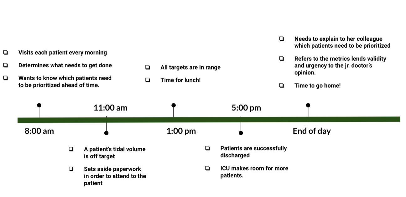
Identifying workflow
During the analysis, I represented the user journey as a day in the life of junior doctor in a concise way. I extracted significant timestamps from the work that the doctor does in a “typical” day, a “good” day, and a “bad” day to construct the timeline. Each timestamp represent a point of interaction with the dashboard.
A few themes emerged after the thematic analysis of interview transcription.
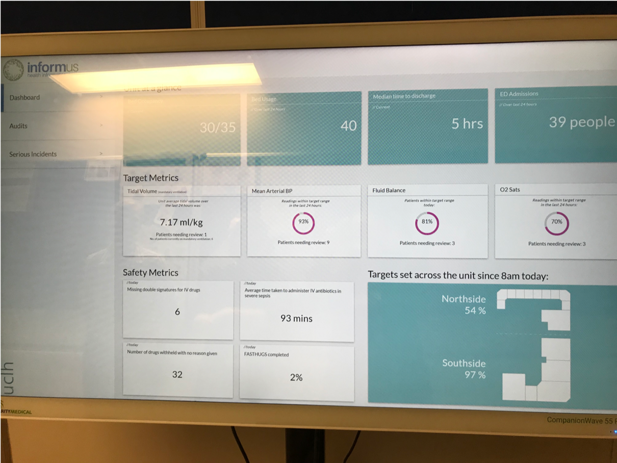
Target metrics
-
Amalgamated data on all metrics would be helpful for junior doctor, i.e. statistics on all patients’ progress collectively, in contrast to what a nurse would prefer, i.e. to go through each patient individually.
-
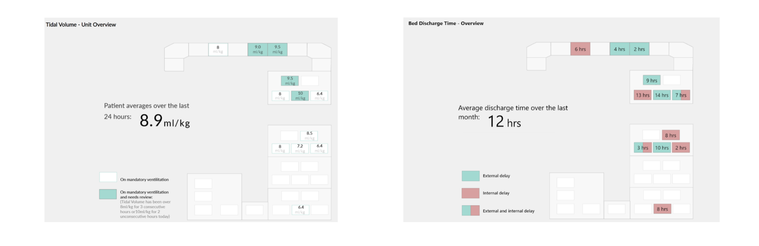
There is a need to describe in details on some metrics that might not be familiar to ward staff. For example, explaining the ideal tidal volume target range next to the metric.
3. Some other target metrics necessary to the doctor’s workflow that the existing prototype lacks:
- Antibiotic taken
- Time last taken
- Urine output
- Length of Stay
- Average temperature
- Heart rate
- No. of patients being ventilated
Impact 👉Clinicians and Care Consultants will reference these target metrics as they further examine the clinical use of those metrics. Metrics will be included for junior doctor’s view of dashboard.
User Interface
The map visualization of the ICU was particularly appreciated. It fits into the mental model of the staff when navigating around the ICU. It was easy for them to associate a patient with a location on a map.
However, there was no clear navigation between pages. There needs to be a locator and back button on every pages. Color coding also lacks explaination.
Impact 👉The usability issues identified were highly appreciated by the UI designer and Care Consultants. Issues will be improved in the next iteration.
Potential risks
Staff morality
The dashboard could lead to a blame culture: wherever out of standard metrics are seen, the responsible nurse is held accountable and might be seen as incompetent. Yet, the patient might just be very sick at that moment, regardless of the nurse’s ability.
“… just looking at this [the four red coded patient bed shown on the dashboard], it kind of flags up those four patients and it does suggest that the people looking after these patients are doing something wrong.”
“Or they might actually just be really sick and none of us are able to fix it. But, just looking at this [dashboard], you can’t see that.”
Although patient care is the top priority, people relationships and a healthy work culture are also important and will inevitably affect patient care. If the technology promotes a blame culture, its usefulness is massively reduced and may even lead to abandonment.
Data safety
The current dashboard prototype is located at the corridor outside the staff rest room. Although it is enclosed within the ICU, there are risks that relatives would misinterpret information presented on the dashboard.
“If it [the dashboard] was nearer the front desk that makes me uncomfortable because of confidentiality, but also because this is the sort of thing that can cause alarm for their relatives.”
Impact 👉Future iteration will consider implementing access control: Only managerial staff would see the performance of each staff so that they could act upon out of range performance by providing appropriate training. Access control also prevents unauthorised users from accessing sensitive information, therefore preventing metrics being interpreted out of context.
Outcome and Deliverables
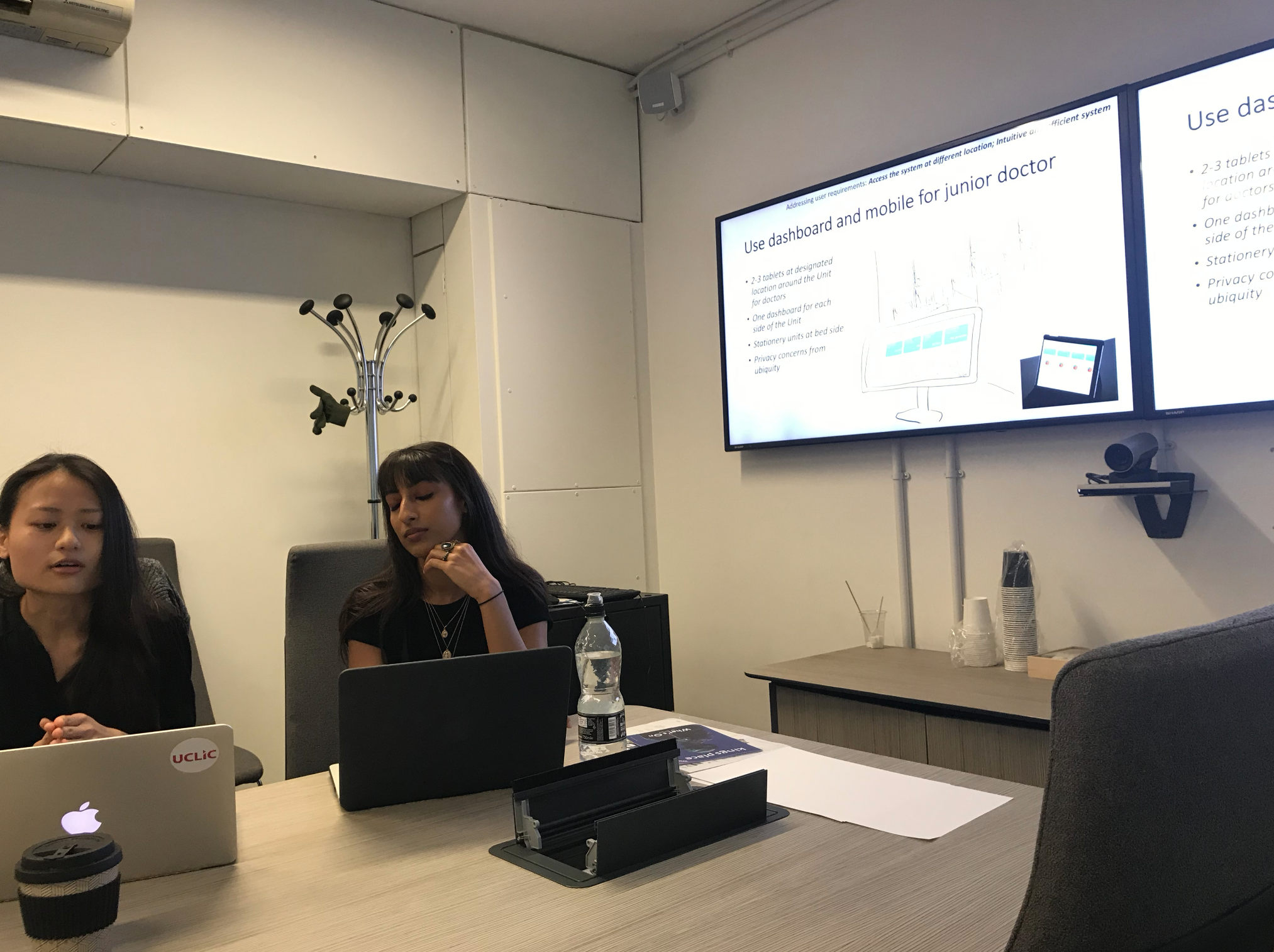
The effective use of a healthcare system requires building trust with the users. Healthcare systems are highly safety-critical, as our interviewee once said: “If you change your system to incorporate a new bit of technology, it needs to prove its worth, otherwise I would lose faith.” That is why the design of patient data dashboard require multiple stages of iteration, user research, and testing before rolling out for actual use. This current user research project is part of the greater development of the patient data dashboard. I represented my user group to present findings and design implications to the UCLH Health Informatics Team. Through the presentation meeting, I interacted with different stakeholders in the organization, including their junior doctors, critical care consultants, data scientists, software engineers, and UX designer.
The team highly appreciated our findings and design implication, and will include them for the next iteration. The implication on interface usability will be implemented, while the advice on access control and dashboard location need further data collection to represent opinions of other user groups.